The core tools that make this possible are three native Excel features:
- PivotTables summarize large datasets into compact, recalculating tables without touching the raw data.
- PivotCharts turn those summaries into visual charts that update automatically when filters change.
- Slicers add clickable filter buttons so any user can segment the data instantly, no formulas required.
Together, these features let you
build interactive dashboards that rival dedicated business intelligence software, all inside a tool most professionals already have. The real advantage over a static report is speed. A well-built dashboard answers a business question in seconds, not after a round of emails asking someone to re-run the numbers.
Table of Contents
Three types of Excel dashboards you should know
Not every dashboard serves the same purpose. Choosing the right type before you start building saves you from cramming the wrong metrics onto the screen.
Operational dashboards track real-time or near-real-time KPIs. Think daily sales totals, open support tickets, or production output. These dashboards refresh frequently and are designed for frontline teams who need to act fast.
Analytical (tactical) dashboards go deeper. They compare trends over time, segment performance by region or product, and help managers spot patterns that daily numbers hide. An analyst reviewing monthly revenue by sales rep is working with this type.
 Strategic (executive) dashboards
 sit at the highest level. They show company-wide health metrics, like annual revenue vs. target, customer growth, or market share, for leadership teams making long-range decisions. The data refreshes less often, but every number on screen carries weight.
Regardless of type, effective dashboards focus on 5–10 key metrics. More than that and the dashboard stops being a dashboard; it becomes a spreadsheet with pictures.
What goes inside a well-built Excel dashboard?
The visual components of a dashboard are not decoration. Each element earns its place by answering a specific question faster than a table of numbers would.
KPI cards sit at the top. A single large number showing total revenue, units sold, or customer satisfaction score gives any viewer an instant status check before they read a single chart.
Charts carry the analytical load. Line charts work best for trends over time. Bar charts compare categories side by side. Bubble charts can show three variables at once, useful for plotting market size, growth rate, and profitability together. Heatmaps reveal concentration patterns across a matrix, like sales by region and month.
Slicers and timelines are what make a dashboard interactive rather than static. Users interact via
slicers and timelines to filter data dynamically without needing an analyst to update anything. A timeline slicer, for example, lets a manager drag to select any date range and watch every chart on the page recalculate instantly.
On the design side, three rules cover most of what separates a professional dashboard from a cluttered one:
- Use a consistent color palette, two or three colors maximum, with one accent color reserved for highlights.
- Match font sizes across similar elements so the visual hierarchy is obvious at a glance.
- Hide gridlines from the View tab and treat the worksheet as a canvas, not a table.
Pro Tip: Size your chart tiles consistently and align them to a grid using Excel's Align tools under the Format tab. Uneven chart sizes are the fastest way to make a dashboard look unfinished.
How to create an Excel dashboard step by step
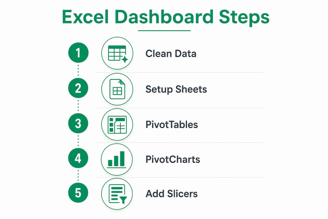
Building a dashboard is a five-stage process. Skipping any stage, especially the first two, creates problems that compound as the file grows.
1. Clean and structure your raw data
Format your source data as an Excel Table using Ctrl+T. This gives the table a defined name, makes formulas easier to read, and causes PivotTables built from it to pick up new rows automatically when you refresh. Remove blank rows, fix inconsistent date formats, and make sure every column has a clear header.
2. Set up a three-sheet architecture
Maintainable dashboards use three separate sheets: Raw Data, Calculations, and Dashboard. No data entry or calculations belong on the Dashboard sheet itself. This separation means a data update never breaks your layout, and anyone maintaining the file later can find what they need without hunting through a single tangled sheet.
3. Build your PivotTables on the Calculations sheet
Select any cell in your data table, go to Insert > PivotTable, and place it on the Calculations sheet. Build one master PivotTable first, format it, then copy and paste it to create variations for each chart you plan to build. Give each PivotTable a meaningful name under PivotTable Analyze > PivotTable Name so you can identify them when connecting slicers later.

4. Insert PivotCharts linked to your PivotTables
Click inside a PivotTable and go to PivotTable Analyze > Tools > PivotChart. Choose a chart type that fits the data: a combo chart works well for showing both volume and percentage on the same axis. Move each finished chart to the Dashboard sheet by right-clicking it and selecting Move Chart.
5. Add slicers and connect them to all PivotTables
Select any PivotTable and go to PivotTable Analyze > Filter > Insert Slicer. After placing the slicers on the Dashboard sheet, the critical step most beginners miss is connecting each slicer to every PivotTable, not just the one it was created from. Right-click the slicer, choose Report Connections, and check all relevant PivotTables. Properly linked slicers filter the entire dashboard with a single click.
 Pro Tip: After connecting slicers, test every combination of filter selections before sharing the file. PivotTables that expand into each other's space will throw an error, and catching that in testing is far easier than explaining it to a stakeholder.
The final layout step is arranging everything on the Dashboard sheet. Place KPI cards across the top row, charts in the middle, and slicers along the left side or top right. Turn off gridlines and headers from the View tab, and your dashboard is ready to share.
Key steps at a glance:
- Format raw data as an Excel Table (Ctrl+T)
- Create three sheets: Raw Data, Calculations, Dashboard
- Build and name PivotTables on the Calculations sheet
- Insert PivotCharts and move them to the Dashboard sheet
- Add slicers and use Report Connections to link them to all PivotTables
- Hide gridlines, align chart tiles, and test all filter combinations
Best practices and common mistakes in Excel dashboard design
The gap between a dashboard that gets used and one that gets ignored usually comes down to a handful of design decisions made early in the process.
Start with the audience, not the data. Define the dashboard's purpose and the specific questions it needs to answer before opening Excel. A dashboard built around "what does the VP of Sales need to decide each Monday morning?" will always outperform one built around "here is all the data we have."
Apply the five-second rule. A viewer should grasp the dashboard's main message within five seconds of looking at it. If they need to study it, the layout or the metric selection needs work.
Common mistakes that break dashboards:
- Linking charts directly to raw data instead of PivotTables. Raw data ranges break when rows are added or columns shift.
- Using pie charts for more than two or three categories. Humans are poor at comparing slice sizes; a bar chart is almost always clearer.
- Dual-axis charts used carelessly confuse viewers about which scale applies to which series. Use them only when the relationship between the two series is the point.
- Skipping the data-layer separation. Putting calculations directly on the Dashboard sheet means one accidental edit can corrupt the whole file.
- Ignoring gridline removal. Leaving gridlines visible makes the dashboard look like a spreadsheet, not a reporting tool.
Pro Tip: Lock the Dashboard sheet with a password (Review > Protect Sheet) before sharing. This prevents accidental edits to chart positions and slicer placements while still letting users click slicers freely.
How to use Excel dashboards effectively for ongoing analysis
A finished dashboard is not a finished project. The real value comes from how you use it over time.
Slicers are the primary tool for dynamic exploration. A stakeholder can click a product category, a region, or a time period and immediately see how every metric responds. This self-service capability means fewer ad hoc data requests landing in an analyst's inbox.
Keeping the dashboard current requires almost no effort when the architecture is right. Paste new data into the Raw Data sheet, then right-click any PivotTable and select Refresh All. Every chart and KPI card updates in seconds. For teams pulling data from external systems, Power Query connects Excel directly to databases, web sources, and other files, and a single click refreshes the entire pipeline.
Formulas add another layer of analytical depth. Functions like GETPIVOTDATA, SUMIFS, and XLOOKUP pull specific values from PivotTables into KPI cards, so headline numbers always reflect the current filter state. Conditional formatting on those cards, green for above target, red for below, turns a number into an instant status signal without requiring the viewer to interpret it.
A few practices that keep dashboards useful as the business evolves:
- Review the metric selection every quarter. A KPI that mattered in January may be irrelevant by July.
- Document the data source and refresh schedule directly on the Raw Data sheet so anyone maintaining the file knows what to update and when.
- Use named ranges or Table references in all formulas so they survive structural changes to the data.
Practice building Excel dashboards with Logicexcel
Reading about dashboards gets you only so far. The skill clicks when you actually build one, make a mistake, and fix it in real time.
Logicexcel offers free, interactive Excel exercises where you practice directly in a browser-based Excel environment, no software installation or account required. You get instant feedback on every step, which is far more effective than watching a video and hoping you followed along correctly.
A good starting point is the Wine Dashboard lesson, a hands-on exercise that walks you through analyzing and interacting with a real dashboard layout. From there, the Excel learning guides cover the formulas and functions, like SUMIFS and XLOOKUP, that power the KPI cards behind any professional dashboard.
Logicexcel's library includes over 77 lessons covering everything from basic table formatting to PivotTable construction, all free and accessible without signing up. If you want to build the muscle memory that makes dashboard creation feel natural, the free Excel exercises are the fastest path there.
Key Takeaways
An Excel dashboard built on PivotTables, PivotCharts, and properly connected Slicers gives any user a self-service analytics tool that updates with a single refresh.
| Point | Details |
| Three-sheet architecture | Separate Raw Data, Calculations, and Dashboard sheets to keep files stable and easy to maintain. |
| Slicer report connections | Link every slicer to all related PivotTables via Report Connections so one click filters the whole dashboard. |
| Limit to 5–10 metrics | Dashboards focused on 5–10 key metrics communicate faster and get used more consistently than data-heavy layouts. |
| Five-second rule | Viewers should grasp the dashboard's main message within five seconds; if they can't, simplify the layout. |
| Hide gridlines | Removing gridlines from the View tab turns the worksheet into a canvas and immediately raises the visual quality. |
FAQ
Can you build a dashboard directly in Excel?
Yes. Excel's native PivotTables, PivotCharts, and Slicers are enough to build fully interactive Excel dashboards without any additional software or plugins.
What do the three types of dashboards cover?
The three standard types are operational (real-time KPI tracking), analytical or tactical (trend comparison and segmentation), and strategic or executive (high-level company overviews for leadership).
What does an Excel dashboard actually look like?
A typical Excel dashboard has KPI cards across the top showing headline numbers, charts in the center for trends and comparisons, and slicers along the side for filtering, all on a clean sheet with gridlines hidden.
Can AI tools like Microsoft Copilot help create Excel dashboards?
Microsoft Copilot, available in Excel for Microsoft 365 subscribers, can suggest PivotTable layouts and generate charts from a prompt, but the underlying architecture, sheet separation, slicer connections, and layout decisions still require your judgment to get right.
Recommended